Walletgyde
My task for Walletgyde was to redesign their current UI for their Matchmaking Prototype that helped everyday people find financial advisors. My goal was to develop a concise navigational system, create a more accessible typographic layout, etc.
.png)
Research
I initiated this project by implementing a pain point analysis using previous user research data and survey results, long discussions with previous UIUX designers, and personal user testing with family and friends.
Pain Points
1. Lack of Legibility with current Typography
2. Graphics and navigation were too confined in "Card" format
3. Calendar was confusing and needs a proper navigation
4. Lack of Navigation of Financial Coach Profile Cards
High Fidelity Prototypes
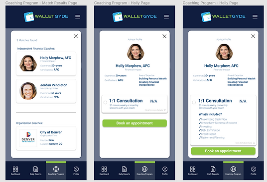
While working around the limitations of a startup, I was given slides that were having issues in the Mobile Translation of the desktop version of Walletgyde, so I created the following High fidelity frames according to Walletgyde's style guide

